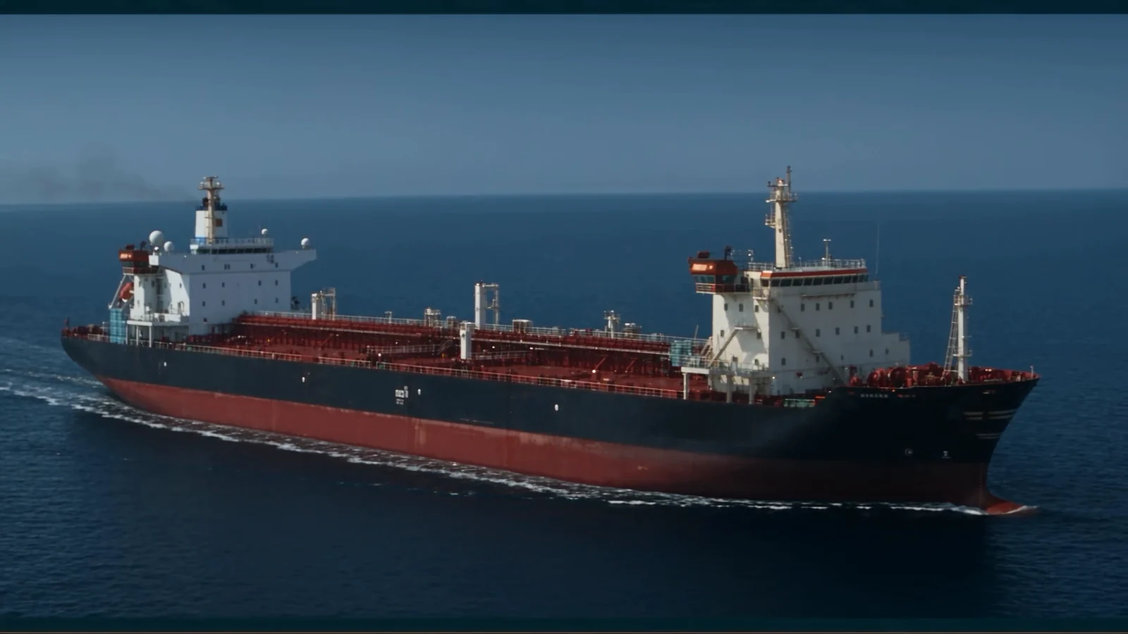
TAQA
Energy is information before it is a commodity.
- Discipline
- Brand system · Motion · Campaign
- Role
- Creative direction · Design system · Motion & edit
- Scope
- Libya · Arabic and English
Overview
TAQA is a platform built so that Libya's energy story can finally be read by the people it belongs to.
Oil, gas and electricity decide most of what happens in the country, yet the reporting around them arrives as fragments: a decree here, a production figure there, an outage nobody explains. The information exists. The meaning does not.
So the brief was never a news logo. It was an intelligence platform — one identity that can carry a breaking headline, a map of fields and pipelines, an expert quote and a long report without ever changing its voice.
The film
The launch film, in both languages.
Two cuts, built from the same grade and the same rhythm — one Arabic, one English — so neither audience receives a translation of the other.
The challenge
Authority without coldness.
Energy branding defaults to two failures: the corporate blue of an oil major, or the alarm red of a rolling news channel. One feels owned by the industry, the other by the crisis.
TAQA had to sit between them — credible enough for a ministry to quote, quick enough to publish an outage in ten minutes, and legible on a phone in low light in the middle of a power cut.
Strategy
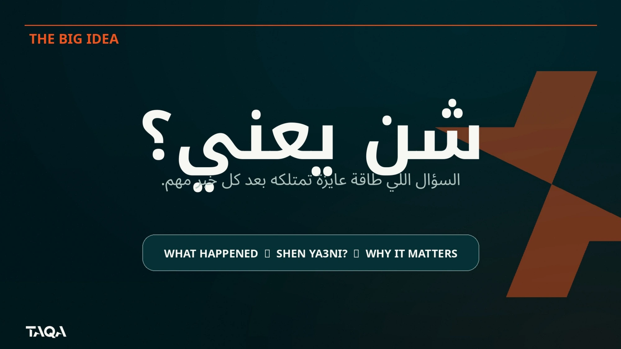
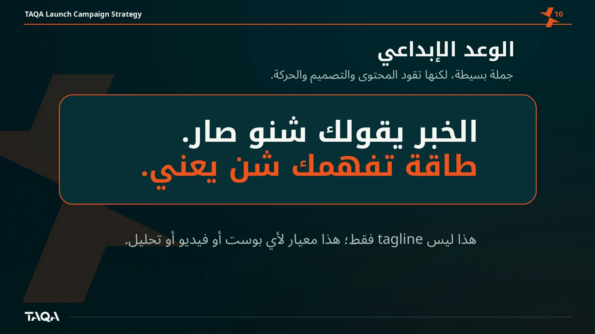
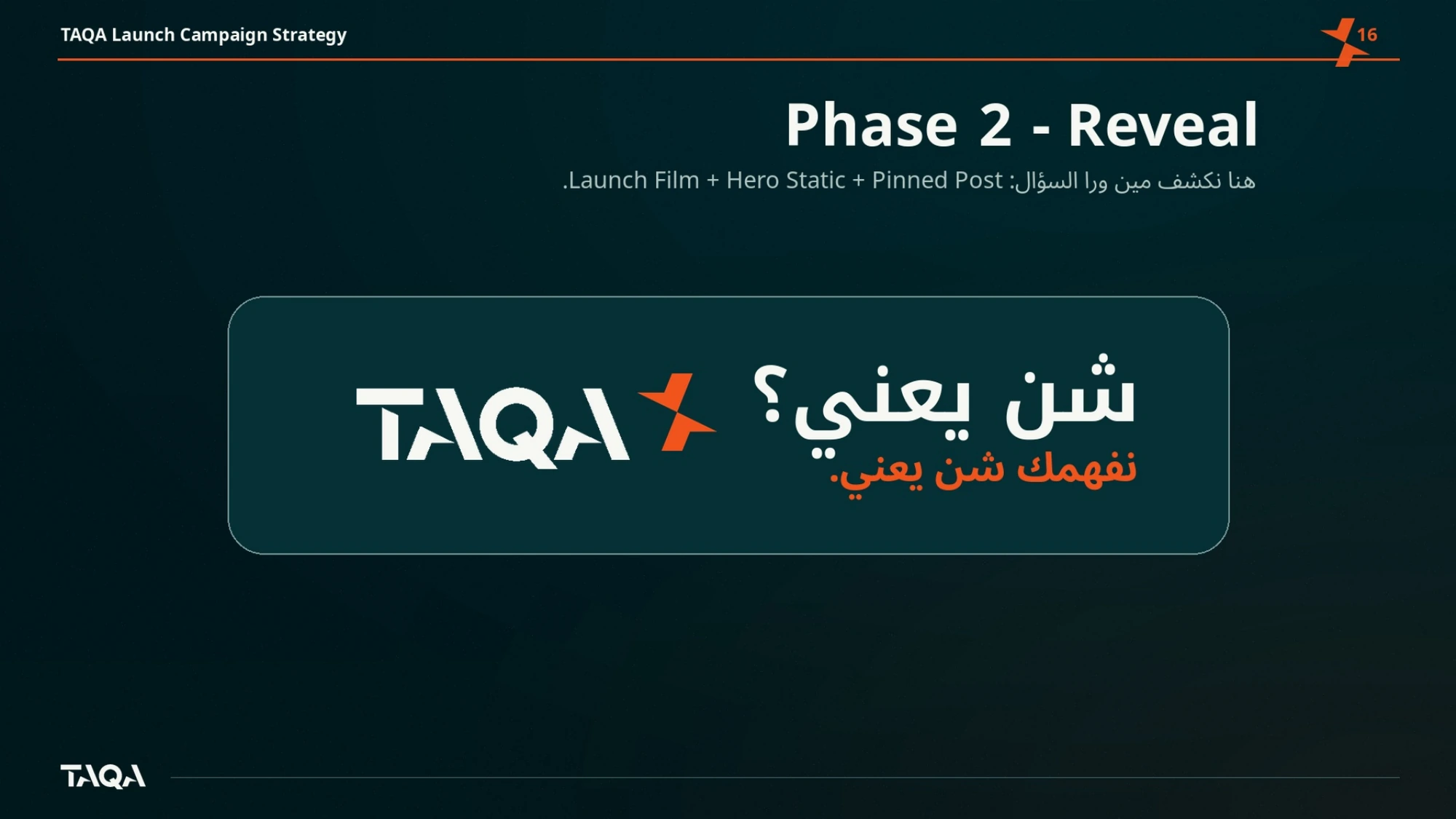
Shen Ya3ni — so what does it mean?
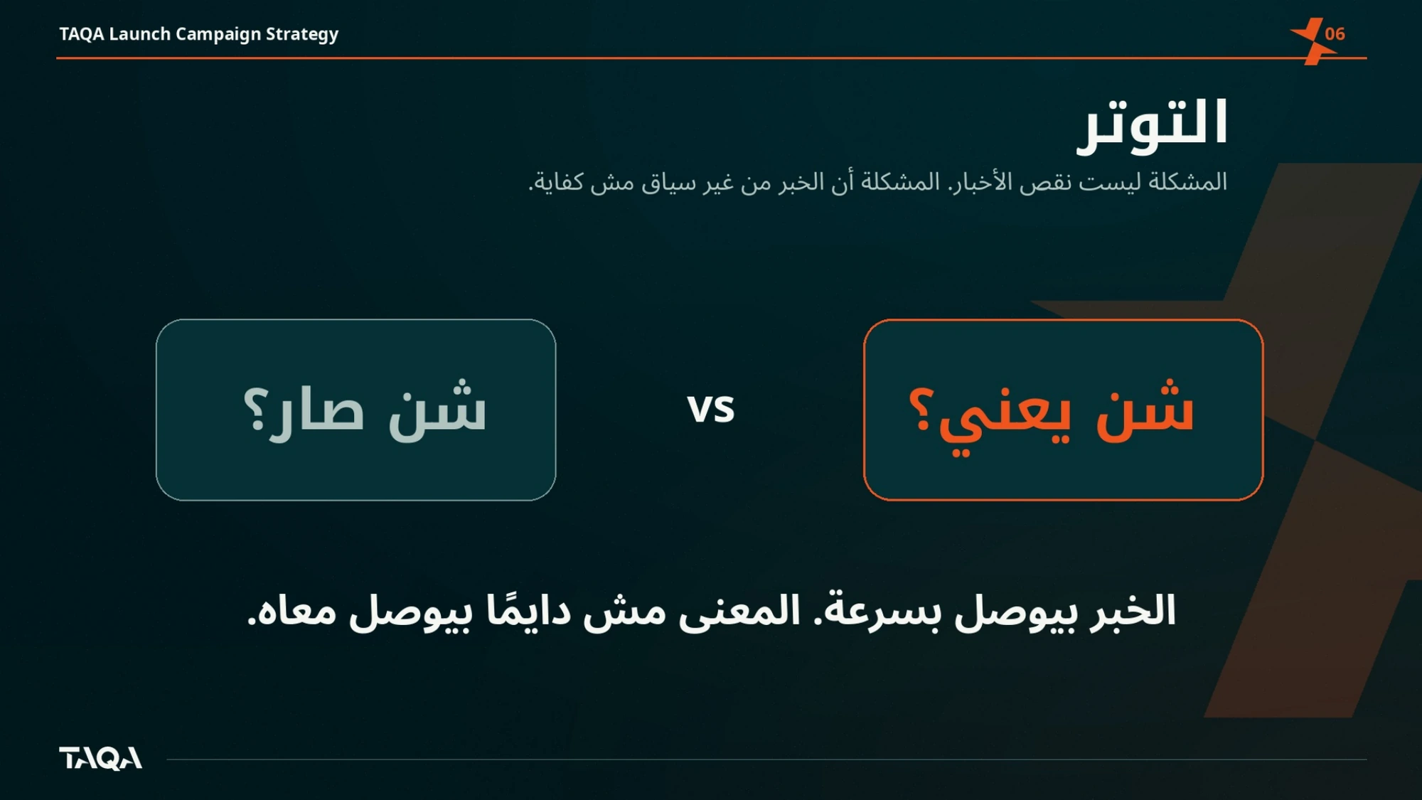
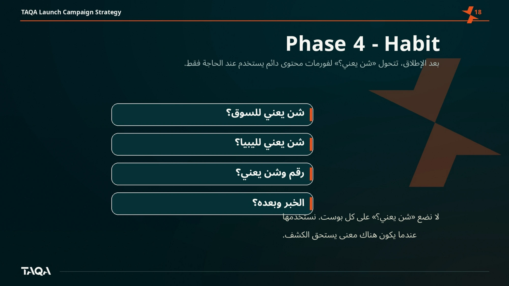
The strategic line came out of the way Libyans actually talk about news: shen ya3ni — so what does that mean? Every piece of output has to answer that question before it earns a headline.
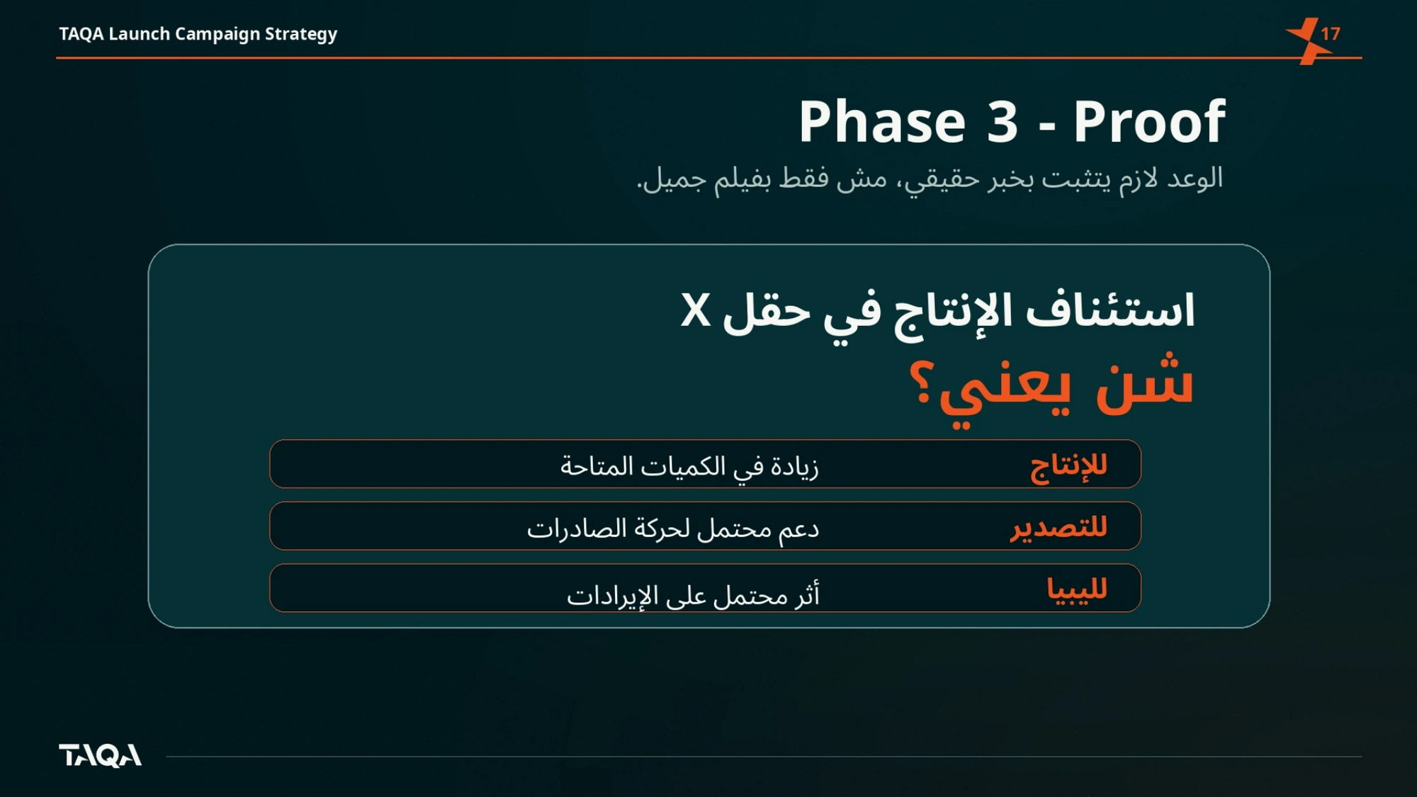
That turned into an editorial contract, not a slogan. Numbers arrive with consequence attached. Decrees arrive with who is affected. The platform's job is interpretation, and the design system is built to make interpretation look like the point.
- Explain, then report — never the other way round
- Arabic first, English equal
- One system across breaking news, maps, quotes and reports
- Built for a phone before a desk
My role
Direction, system, motion.
Creative direction across the identity, the design system and the launch campaign, then the motion language and the edit of both film cuts. The work was delivered as a working kit rather than a presentation — templates the newsroom can publish from daily.
Process
How it came together.
- Positioning
- Naming logic
- Identity
- Motion system
- Templates
- Launch
Visual system
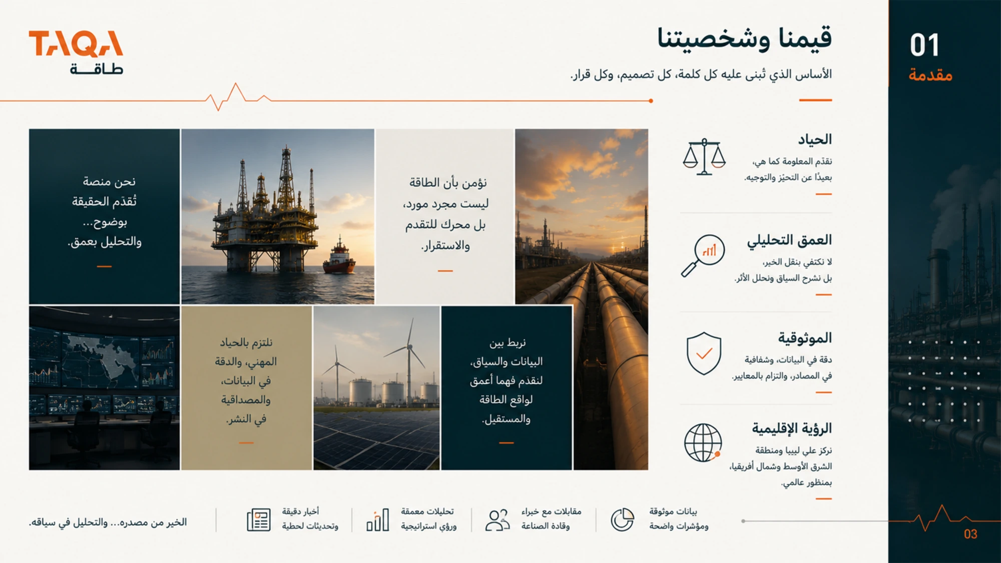
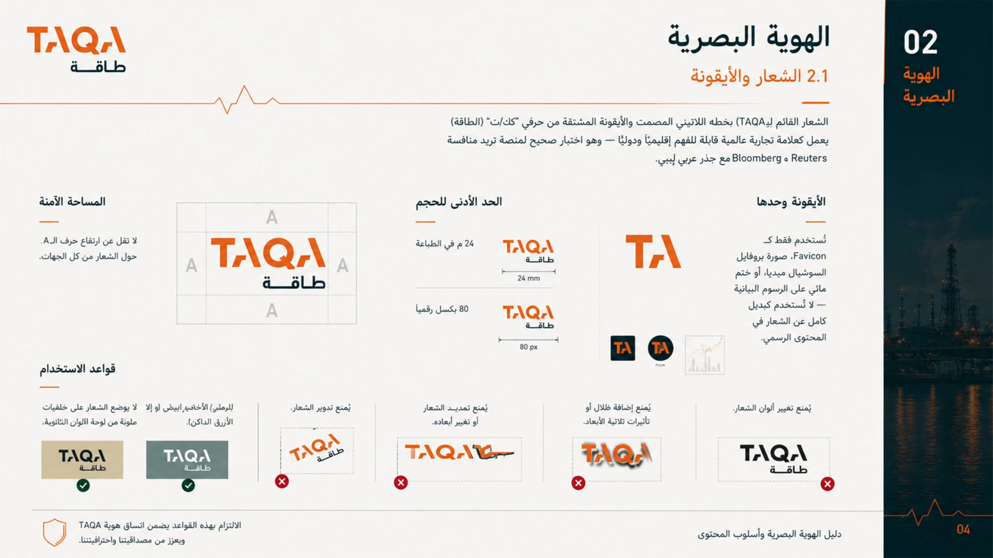
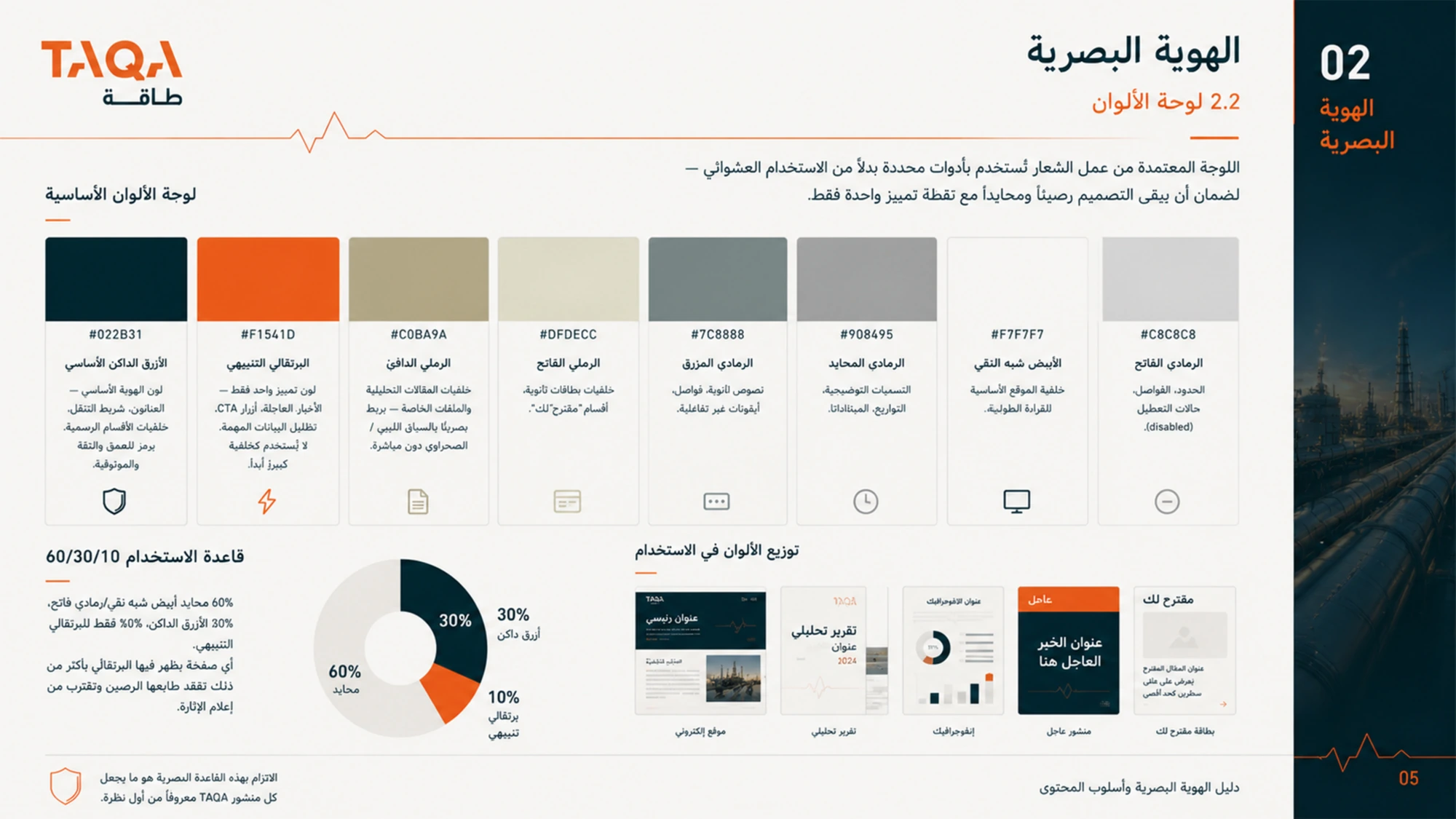
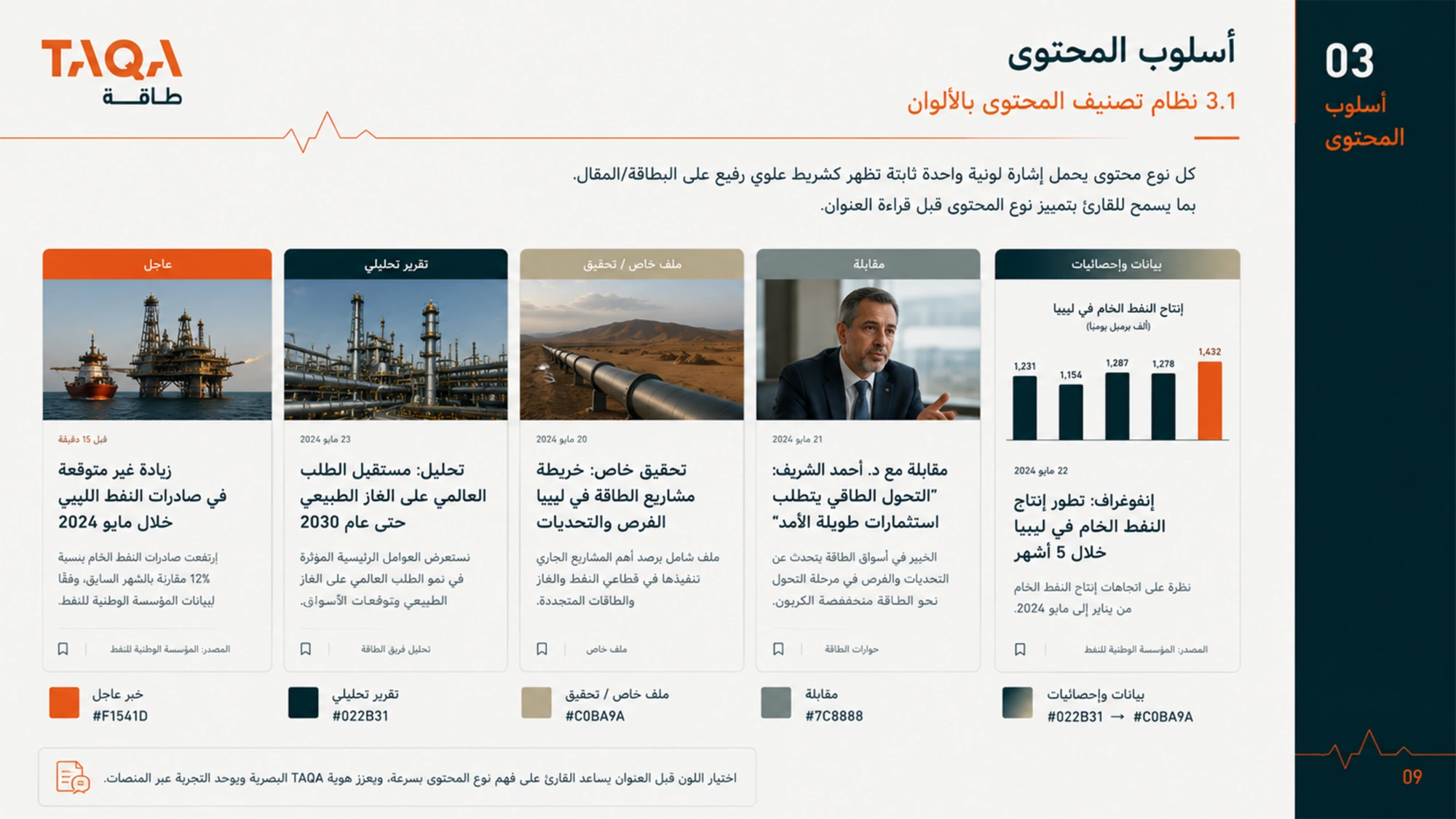
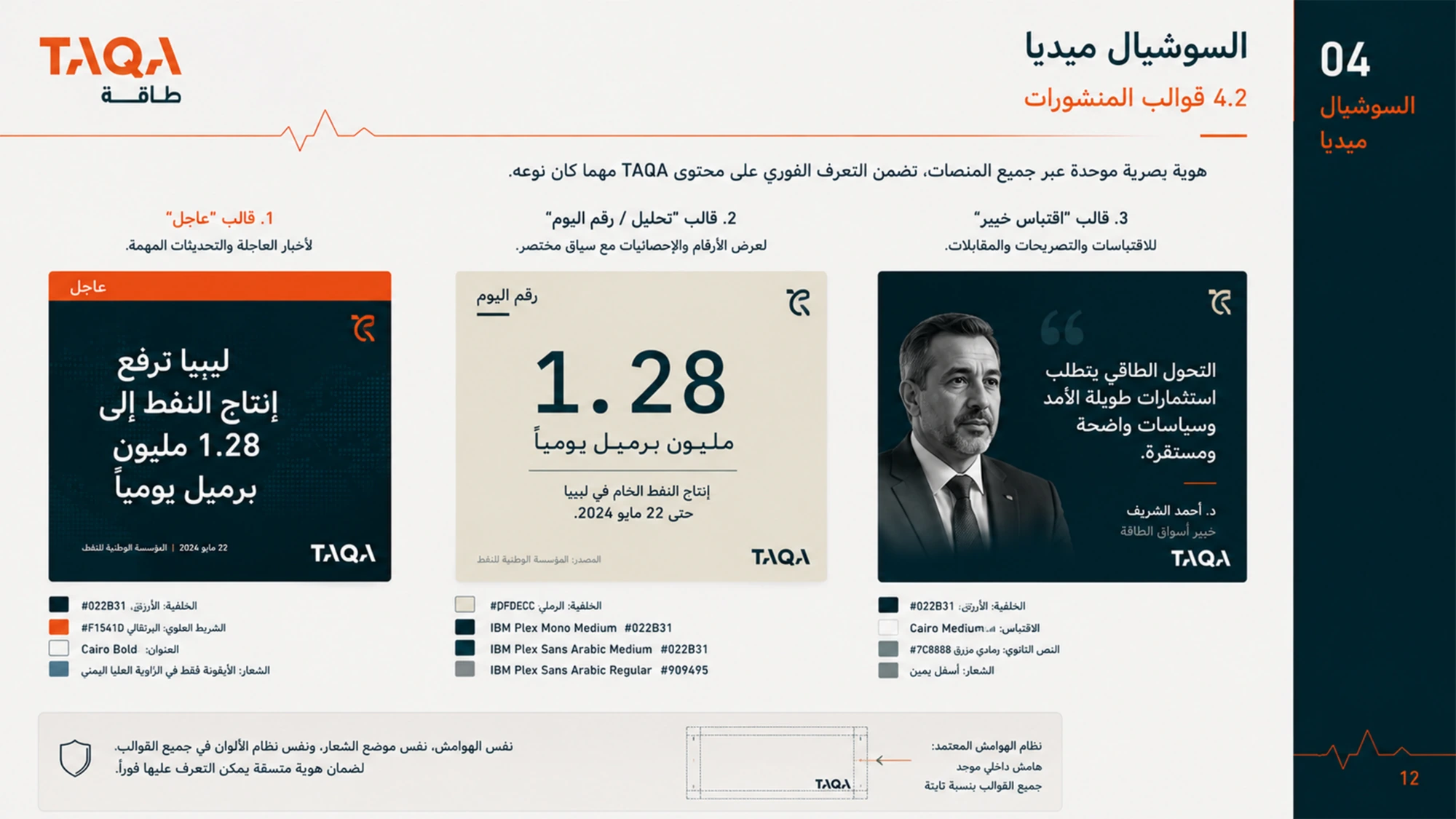
A grid that behaves like an instrument panel.
Deep teal as the ground, a single industrial orange for whatever matters most in the frame, sand and slate for everything that supports it. The wordmark is built from the Arabic and Latin forms of the same word, so neither reads as a translation.
Motion system
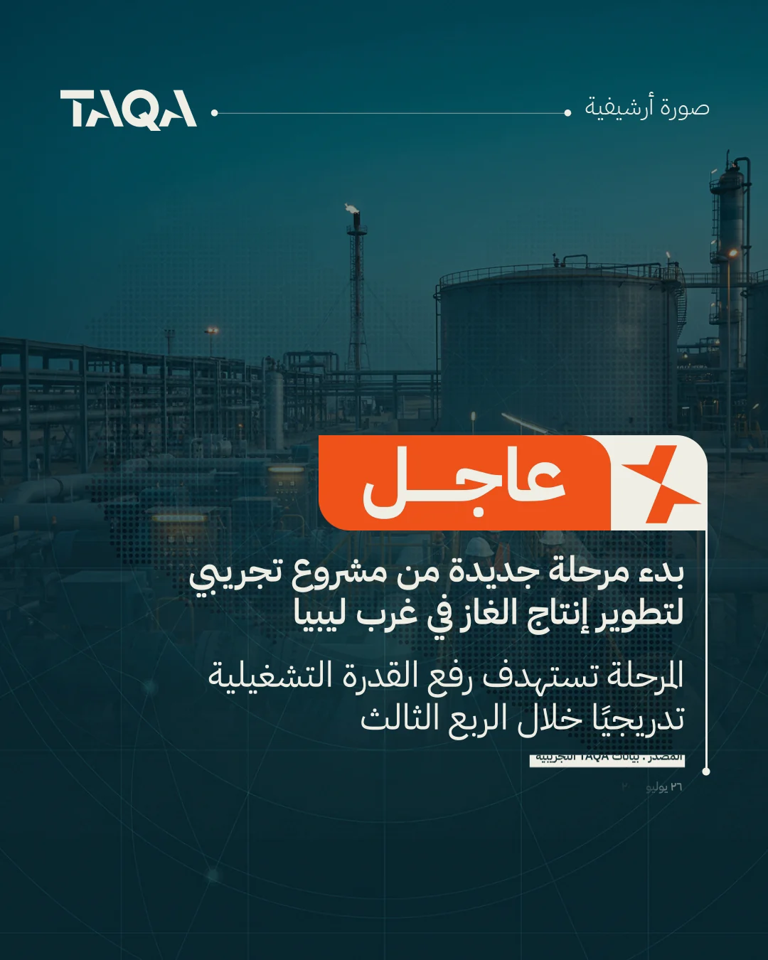
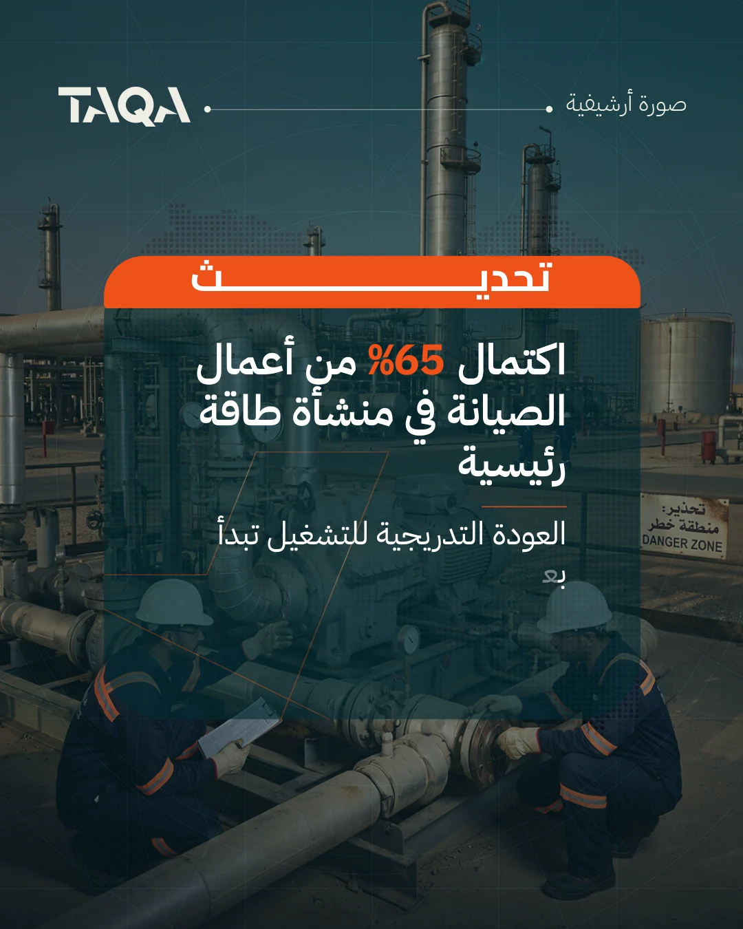
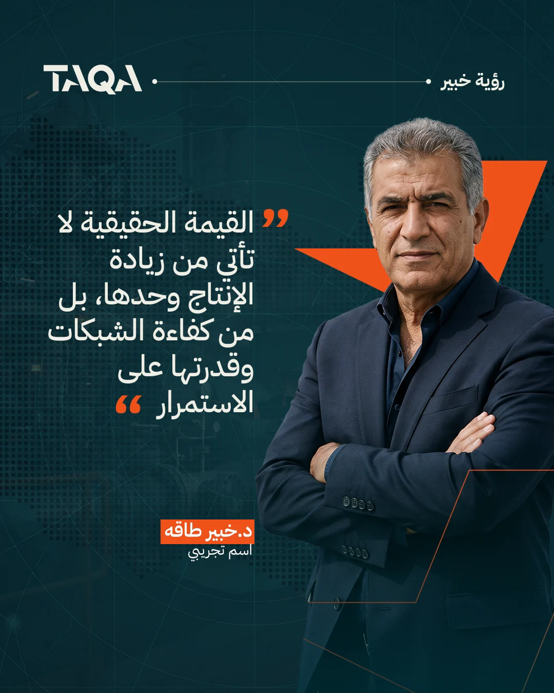
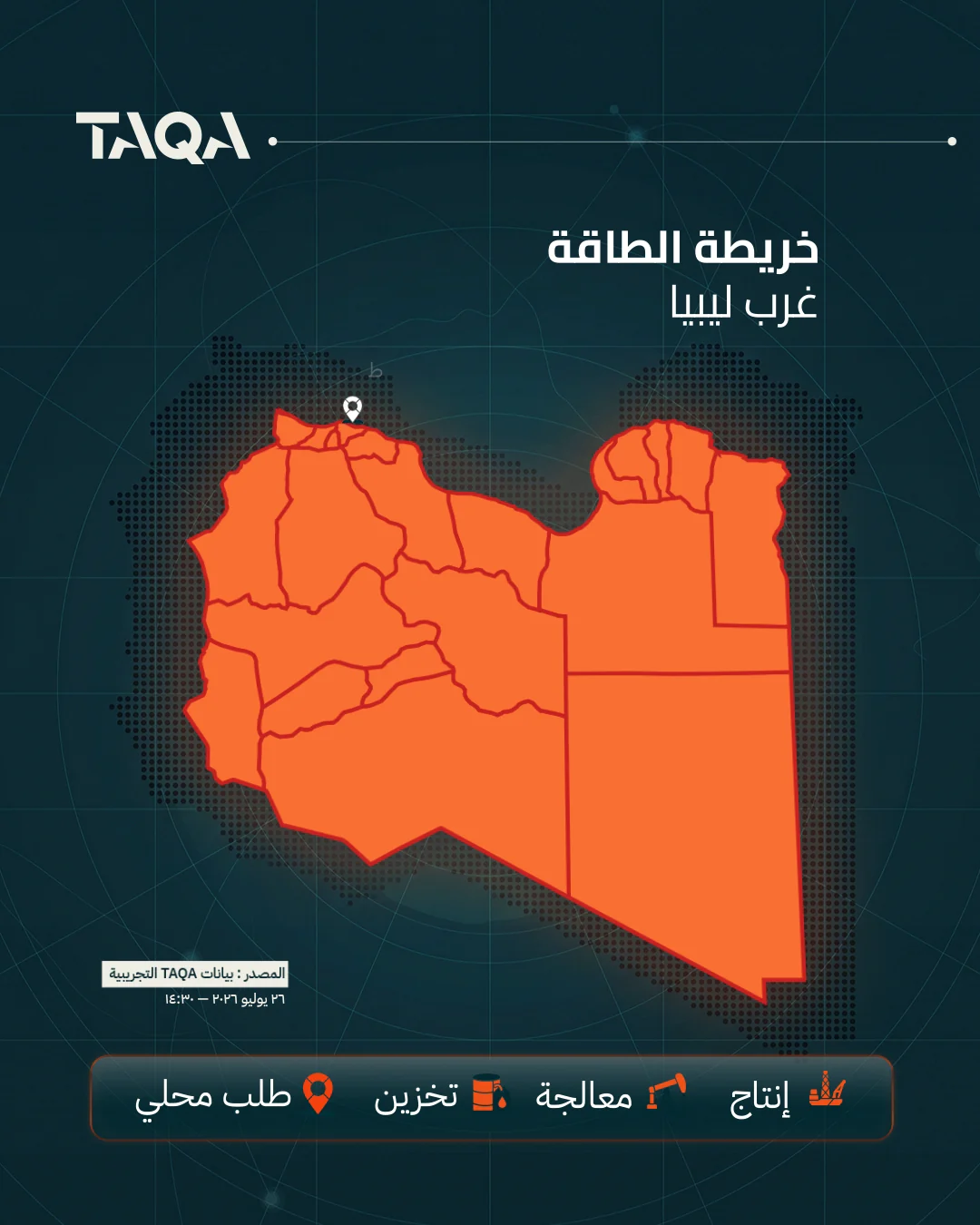
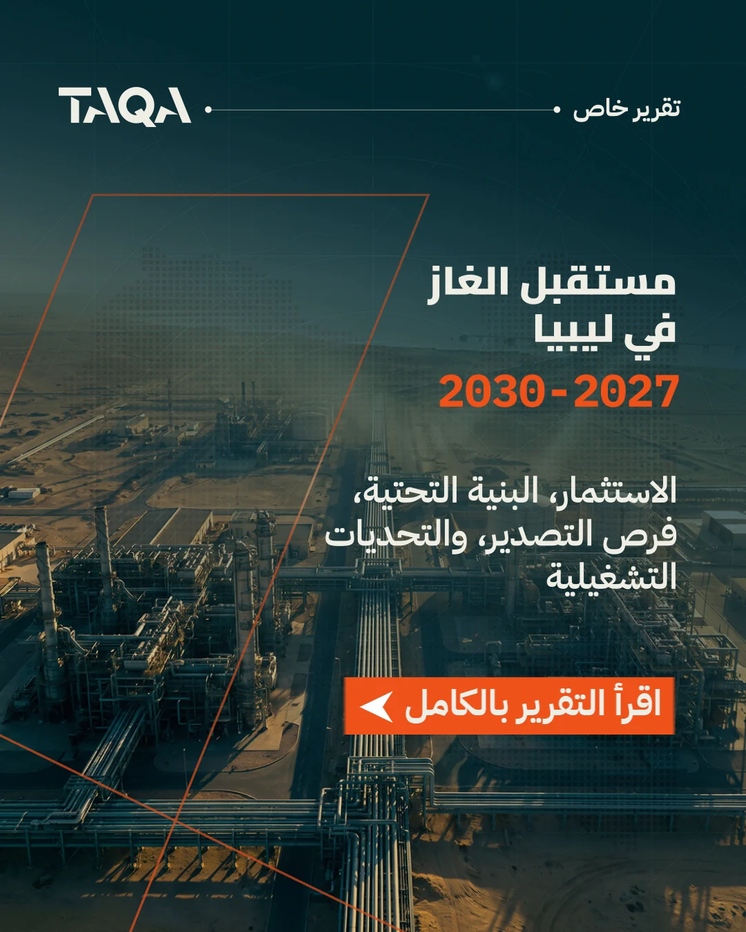
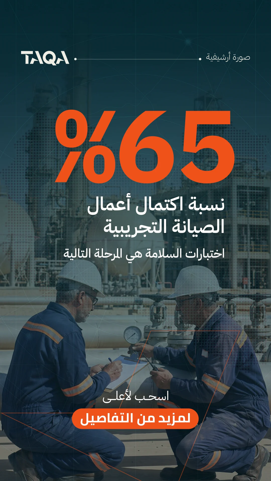
Six formats the newsroom can publish from.
Motion here is structure, not flourish: everything enters on the same easing, holds long enough to be read, and leaves without a transition. Each format is a template — headline, map, quote, report — so a story published at speed still looks composed.
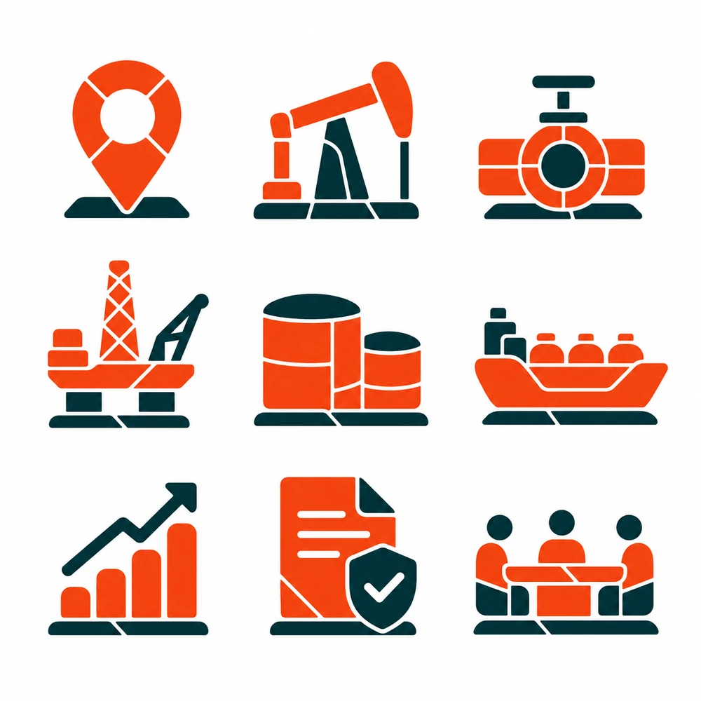
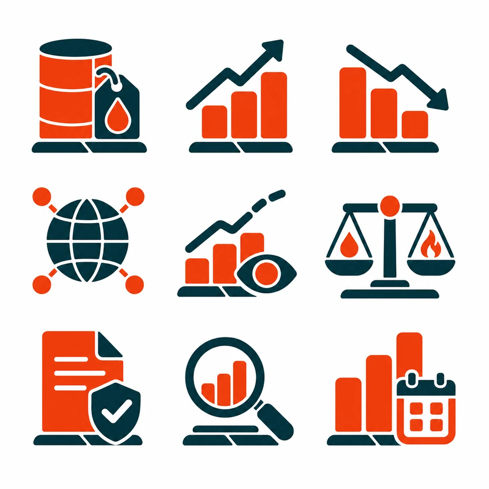
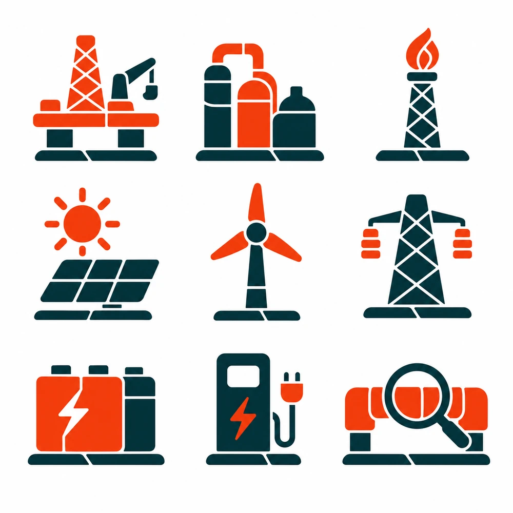
Icon system
Infrastructure, drawn at one weight.
Refineries, wells, grids and tankers reduced to a single stroke weight so a map can carry twenty of them without turning into noise.

Launch campaign
Launched with a question, not a claim.
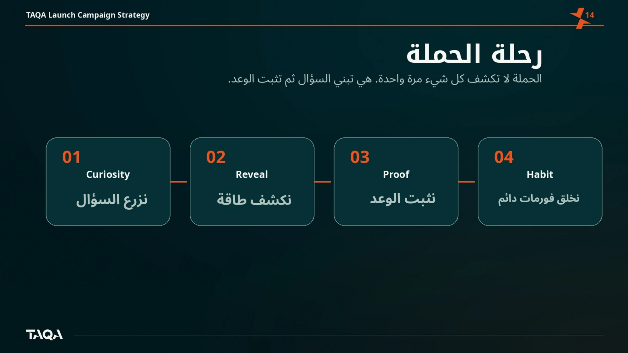
The campaign opens on the tension — a country that produces energy and still waits for answers — and closes on the promise the platform can actually keep: explanation.
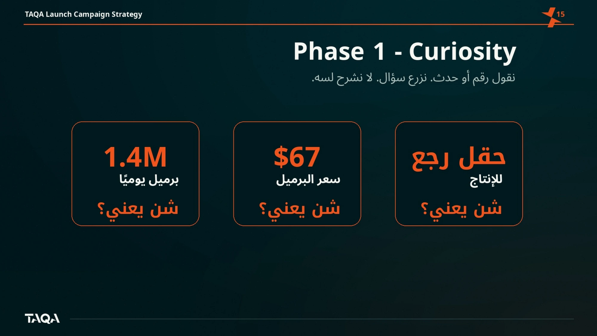
A barrel is a number. What it changes is the story.